The Psychology of Color is the study of color as a determinant for human emotion, reaction and behavior. Color can subconsciously influence emotions, and how humans react to things such as taste of food, products, and experiences. As a marketer, you can tap into this influence to elicit the best possible reaction towards your content, and even to sway purchases.
While it’s fairly common knowledge that colors can impact decisions, reactions to colors can change from person to person. This variance makes it challenging to pinpoint which colors will achieve a given result. But, it’s still important to know your target audience inside and out to best determine how color might influence them. The reactions people have to color can be determined by factors such as experiences, gender and memories, so there are no hard and fast rules about the best colors to use across the board. However, studying the basic understandings of color psychology can be useful. In fact, according to research from QuickSprout, color is responsible for 85% of the reasoning behind making a particular purchase.
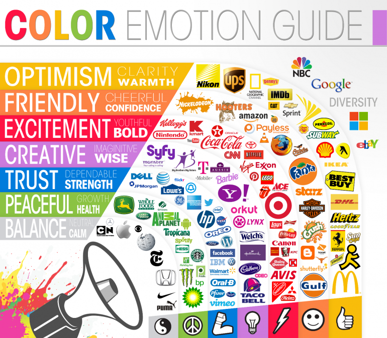
You may also have noticed a trend in social media branding colors. What do Facebook, Twitter, Tumblr, LinkedIn and Skype all have in common? (No, this isn’t a joke with a funny punchline. We apologize if we got your hopes up). They’re all predominantly blue.
Coincidence? We think not.
Blue is a soothing color, promoting clear communication, so it’s no wonder some of the biggest social media networks employ it for their platforms. The effect blue has on a person is a mental response; it’s a color that inspires calm, logic, trust and loyalty. Time and time again, blue has proven to be the most favored color around the world. Perhaps the big social media whizzes have adopted blue for their branding because users are more likely to feel relaxed when using the app, and therefore associate positive emotions with the company. Furthermore, Instagram may not have a blue logo, but the images that attract the most engagement on the app are predominantly blue. Psychology is fascinating, right?
Green is the color of balance and restfulness, and is also associated positively with the outdoors and the environment. If your company is somehow related to the outdoors or nature, utilizing green in your branding or on your website can have a positive emotional influence on a user, which they will then associate with the activities you sell or promote. Green is a reassuring color on a primitive level, because it suggests life and growth, and the exact opposite of famine or drought. So, green for outdoor sporting goods, camping, fishing, or companies that simply want their clients to feel relaxed in the outdoors = good.
Orange, on the other hand, evokes a sense of urgency. Amazon uses orange in their ‘limited time only’ boxes to make the notice more immediate and actionable. However, be careful when using orange. It’s a ‘fun’ color, so overuse can be seen as frivolous and it may make it hard for your brand to be taken seriously. It’s a good choice for a brand like Nickelodeon, given that it’s a fun, quirky brand for kids. It’s just a matter of deciding if the color fits your brand’s image. If you’re a professional divorce lawyer, you may want to stay away from too much orange in your logo and website. You’d probably be better served using a more professional and polished color scheme. After all, we both know your brand is awesome, but you need to make sure prospective clients do, too.
Found to promote creativity and problem-solving, purple is often used to advertise anti-ageing and beauty products. Often associated with royalty, meditation and respect, purple can also be a useful color to promote a luxury brand. However, it’s named as one of the top three least favorite colors of men, so if you’re targeting a male audience, purple may not be the best choice.
Interestingly, darker colors are better for information-processing, so if your website has a lot of detailed content, consider employing shades from the darker end of the spectrum. Bright colors, on the other hand, evoke energy and action. If your website requires little reading and information-processing, and more action (such as making a purchase), you may find bright colors helpful.
When used correctly, color can help reiterate your brand message. But, if used incorrectly or ineffectively, color can inadvertently change your messaging. The more colors you employ in your marketing materials, the more confusing it can be for potential clients to understand your message. It’s been proven that people prefer simple combinations or 2 or 3 colors rather than anything more complex. The more colors portrayed, the more time an audience will spend interpreting your message, whereas a simple color pallet can help potential customers focus and better-understand your content.
Your brand logo, social media posts, blog and website can all benefit from color awareness. You don’t want to accidentally turn off clients from your brand before they’ve even made it past your social media or website homepage. Take the time to ensure all of your color choices accurately reflect your brand and your target audience. This extra effort can have a big influence on purchasing decisions and brand sentiment.