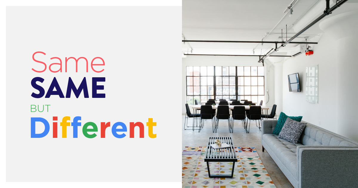
When every brand looks the same, do you follow suit or stand out?
It all began with Silicon Valley startup brands who came of age, and wanted to be perceived as the big players that they now are in our lives. From Google, to PayPal, to Airbnb, this generation of companies grew from zero to hero at speeds completely unlike the mega brands before them. In the span of only a few years, these up-and-comers came to not only match, but in some cases eclipse, the cultural reputation of past goliaths such as Unilever, Sony and Nestle.
EVERYBODY FALL IN LINE! pic.twitter.com/B9JU5nvpMu
— OH no Type Co (@OHnoTypeCo) February 13, 2018
With that historic growth came a unique problem. Many of these brands started out with logos created at the hands of scrappy talent with scrappy strategic approaches. To become fully-evolved and established brands, they needed to shed idiosyncrasies and adopt a presence of unchanging reliability, while simultaneously maintaining an appearance of youthful vitality.
Across the board, brands accomplished this balancing act with a mix of generic sans serif typefaces, big flat colors, and mid-century modern-inspired photography, which had separately come into vogue in the homes of maturing millennials.
And so, the aesthetic known as “airspace” was born.
Design by Limitations
These geometric fonts and flat colors had other practicalities as well. Thanks to technological evolutions, digital interfaces could no longer be static, but instead required “responsive” design across a diverse range of device sizes and orientations. Consumers began expecting content to assimilate across those devices at lightning speed to ensure a seamless user experience.
This rendered complex effects and layered gradients impractical, which continues to be the case today. Remember the ‘00s when those glossy, plasticky, rounded buttons were everywhere? That effect required unresponsive image assets to be served to you, but serving images is slower than simple code telling the button to be a flat color. Very recently, simple gradients were added to the airspace vocabulary (think of Instagram’s new logo or the aesthetic shift from iOS 6 to 7) because it became technologically possible to serve attractive gradients using simple lines of code rather than image assets.
Font use also became dictated by responsive practicalities. In the post-smart phone era, logos are now displayed as small half-inch by half-inch squares on the screen of your phone and needed to be quickly identifiable within a grid of other half-inch by half-inch squares. And within the apps themselves, logos needed to work at an even smaller scale to free up as much screen real estate as possible for the actual functions of the application. Therefore, serifs were quickly replaced by the cleaner, simpler format of sans serif fonts.
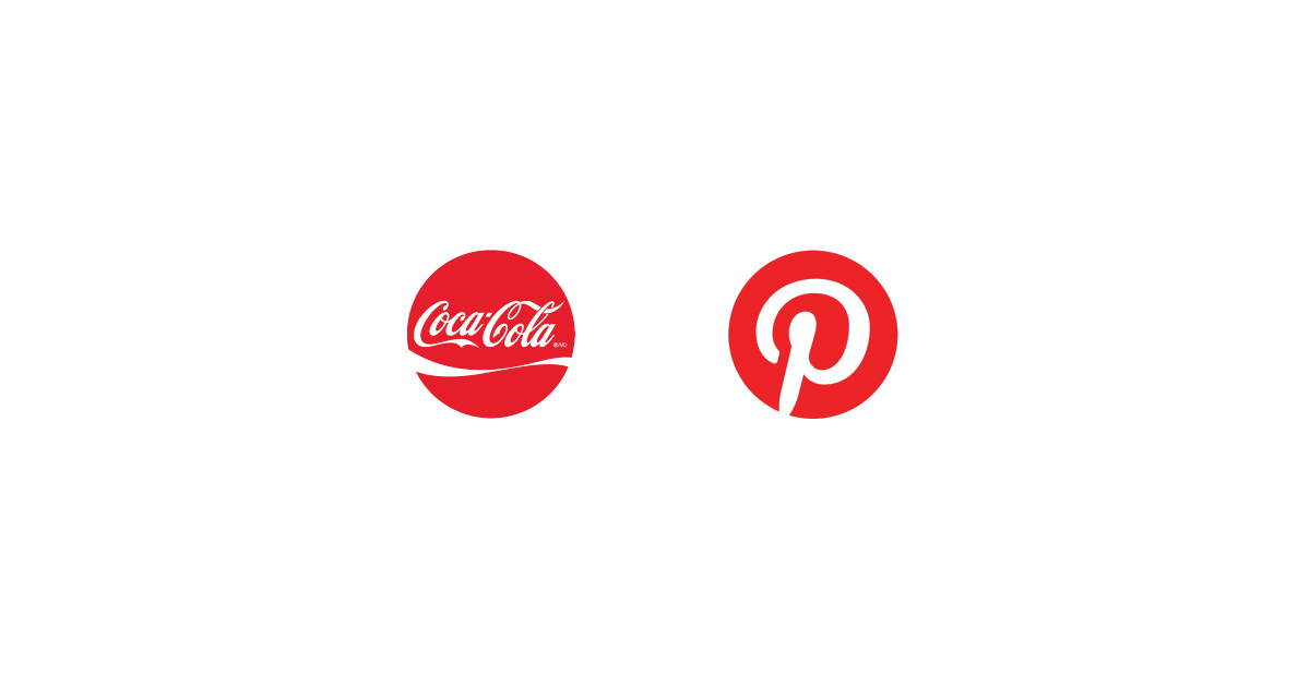
The classic but complex traditional Coca-Cola logo within a little red circle next to a Pinterest in a red circle of the same size will always be read slower.
When everybody falls in line
With the newfound day-to-day dominance that these Silicon Valley startups now hold in our lives, the airspace aesthetic began spilling into our lifestyle brands. Whether you’re walking into a trendy coffee shop or an Airbnb anywhere in the world, you’ll likely be greeted by that same mix of clean, geometric light fixtures and big, flat colors juxtaposed to exposed wood or brick. New brands for everyday objects, be it mattresses à la Casper or fashion, such as Warby Parker or Lululemon, invoke that same airspace aesthetic because their audiences (both their investors and consumers) identify with those Silicon Valley brands.
![]()
What it means for brands
These days, we see even more formerly traditional brands jumping on the airspace bandwagon. It may be that adopting the current winning solution is still the best move for some brands, but as increasingly more companies adopt the same branding solution, a homogeneous vacuum is created. More daring brands have the opportunity to stand out and fill the void.
Brands today encompass much more than just a logo in isolation — since adopting a simpler, more clinical sans serif look, companies such as Spotify, Airbnb, Uber and Pinterest must create and convey their brand personalities through other materials. These days photography, illustration, writing-style, language, and overarching philosophy all play a big role in how audiences identify with your brand.
A holistic brand strategy is more critical now than ever before. In a world where everything seems standard, quantified and predictably packaged, it’s up to specialized brand strategists to navigate how to stand out where most simply cannot.
Need help developing a brand that fits in while standing out? Get in touch to learn more about how we can help navigate your brand!